Making it look right
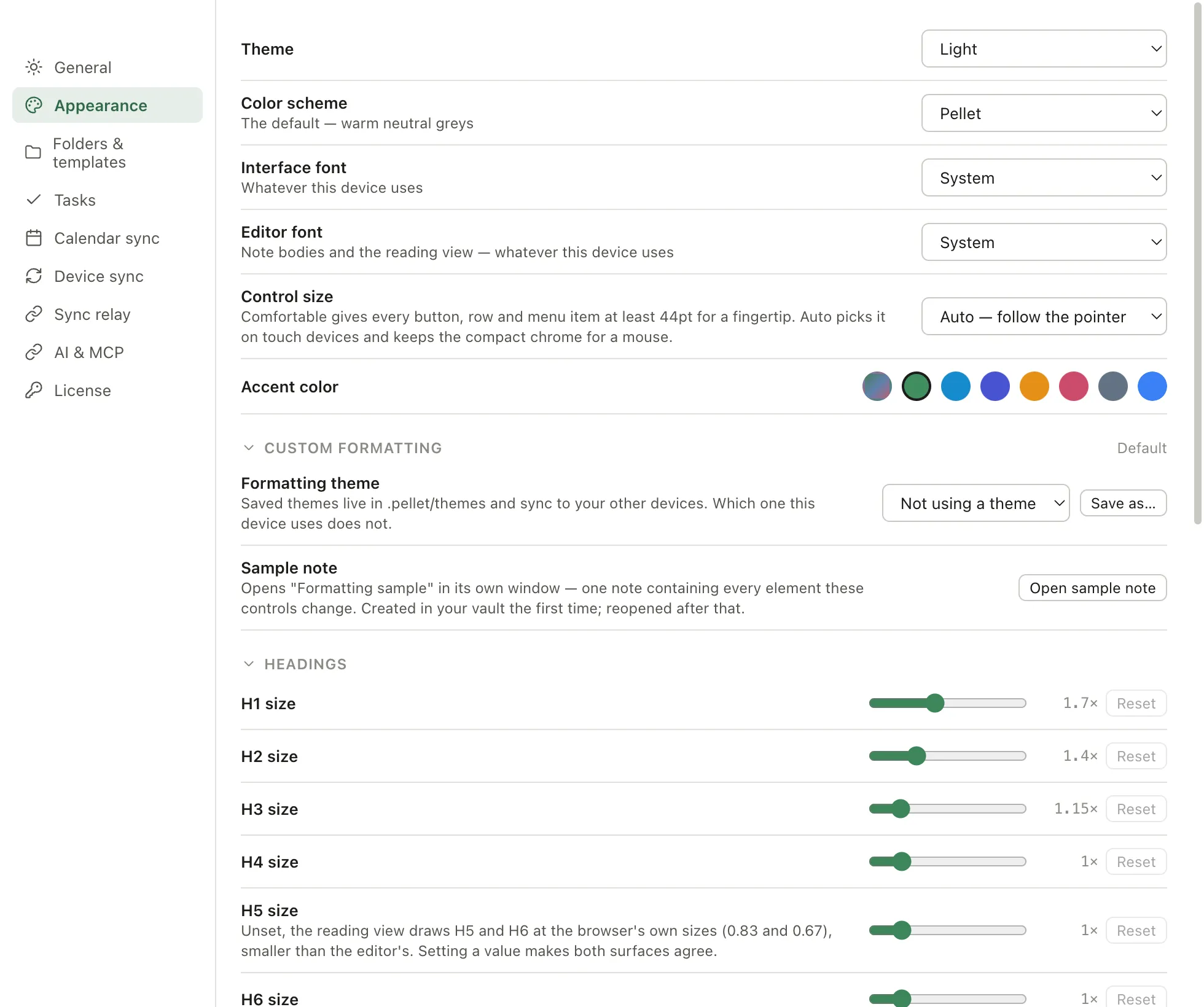
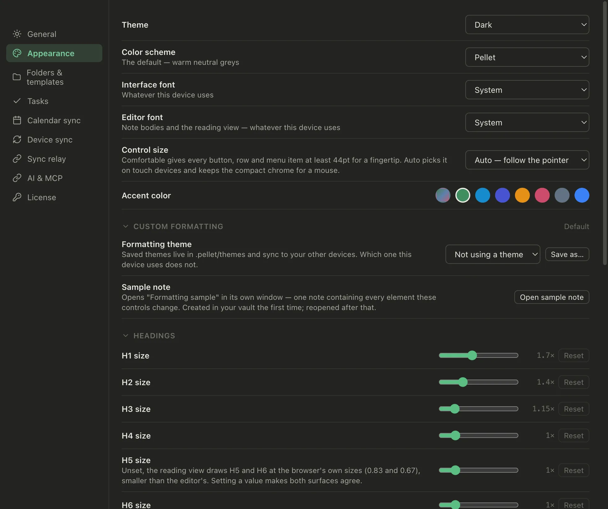
Settings → Appearance. Sensible defaults over a wall of switches — but the things people actually change are all here, and below them a set of formatting controls for people who want to go further.
Light and dark
Section titled “Light and dark”Light, Dark, or System to follow your computer. System is the default.
Two independent choices, which is worth understanding because it’s more flexible than most apps:
- Color scheme — the grays the whole app is built from. Eight of them. One, Carbon, is dark-only: it’s built on true black, and a light version of it would be a different scheme rather than the same one.
- Accent color — the highlight used for selection, links and buttons. Six named ones, plus auto, plus a custom swatch you pick yourself.
They’re separate. Any accent works on any scheme, so you can have a warm neutral scheme with a cool accent, or set the accent to auto and let the scheme pick its own.
A custom accent keeps only its hue and saturation — each theme decides its own lightness, which is what stops a pale accent disappearing on a light background.
Interface font and editor font are set separately. A tidy sans for the app chrome and something more comfortable for long reading is a common pairing, and one most apps won’t let you have.
Control size
Section titled “Control size”How big the controls are.
- Auto (default) — comfortable on touch, compact with a mouse
- Comfortable — every button at least 44×44pt, the size Apple recommends for fingers
- Compact — tighter, more on screen
Auto reads the pointer, so an iPad gets the roomier layout and a desktop the tighter one without you choosing.
Custom formatting
Section titled “Custom formatting”Under the settings above, Custom formatting changes how your writing itself looks — headings, body text, quotes and code, tables and callouts. Around forty controls in five collapsible groups, each one a slider, a colour or a weight, applied live to every note.
Every control has a default, and anything you don’t touch keeps it. There’s no theme to install and nothing to write CSS for.
Capitalize sentences
Section titled “Capitalize sentences”Under Body, a switch that types the first letter of a sentence as a capital: at the start of a line, and after a full stop, question mark or exclamation mark. It’s off unless you ask for it, because unlike everything else in this section it changes what’s in the note rather than how the note looks.
It tries hard not to get in your way. It won’t fire after e.g., etc., Dr. and the like, or on 3.14 and foo.md where the dot isn’t ending anything, and it leaves code, link addresses and frontmatter completely alone — a bullet, a quote marker or a checkbox in front of the sentence doesn’t confuse it either. Pasted text is never touched, only what you type.
Wikilink brackets
Section titled “Wikilink brackets”Under Body, a switch for the [[ and ]] around a link. Normally live preview hides them and shows you just the link; turn this on and they’re drawn beside it, dimmed, so you can see the syntax while you write. A link with an alias still shows only the alias.
Underlining links
Section titled “Underlining links”Also under Body, one setting with three answers: On hover, Never or Always. It covers both kinds of link, notes and web addresses alike.
On hover is the default and is how links have always looked — coloured rather than underlined, with a line appearing when you point at one. Never takes the line away entirely, pointer included, so links are told apart by colour alone. Always underlines them the way a web page does.
It also decides how links print. Exported and printed pages used to underline every link no matter what — that came from the browser, not from Pellet — and they follow this setting instead. A printed page has no pointer, so On hover and Never look the same there; Always is the one that prints a line.
See what you’re changing
Section titled “See what you’re changing”A slider is hard to judge against a settings screen. Open sample note makes a note in your vault containing every element these controls affect — headings at all six levels, quotes, code, tables, each kind of callout — and opens it in its own window, so you can watch a change land on real prose.
It reuses the note if it already exists, so a second click won’t overwrite anything you’ve scribbled in it.
Formatting themes
Section titled “Formatting themes”Once a set of formatting you like is dialled in, save it as a formatting theme with a name. Saved themes live in .pellet/themes/ and sync to your other devices — but which one a device is using doesn’t, so a big screen and a phone can want different type and both be right.
Picking one applies it. Change a control afterwards and the theme shows as modified until you save over it or switch back.
Dates and times
Section titled “Dates and times”These live under Settings → General, not Appearance:
- Week starts on — Sunday or Monday
- Time format — 12-hour or 24-hour
They affect the calendar and every date shown in task views.
Focus mode
Section titled “Focus mode”⇧⌘F hides every piece of chrome and leaves the document. Press it again and the window goes full-screen as well, so the document is the only thing on the desktop. A third press puts everything back.
Esc leaves entirely, from either stage — you never have to remember how deep you went. It’s ignored while a modal, the quick switcher or a menu is open, since those want the key first.
On a phone or tablet there’s no second stage; ⇧⌘F hides the chrome and stops there.
It’s a mode you turn on for a stretch of writing, not a preference — it doesn’t persist across restarts, by design.